Icon

ben brady

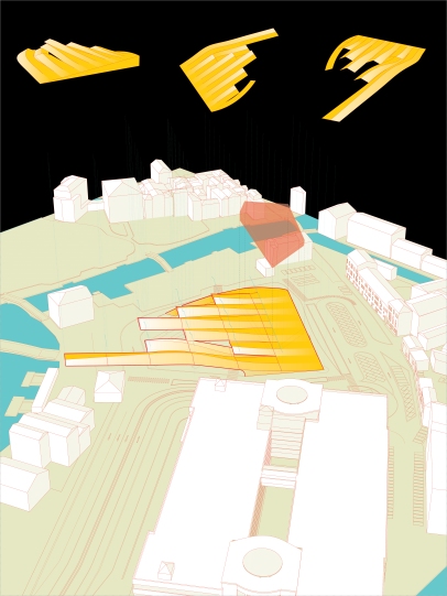
VENICE 7: PLAN DIAGRAM

Today is a good day because today I became an uncle for the second time in 3 months.  My sister Rebecca had Bode 3 months ago and my other sister, Laura had a little girl, Reese, today.  I am very proud and happy for her and wish I could be home to celebrate and see the new person.

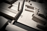
Aside from that, I am having fun with my “graphic approach” to studio this semester.

Filed under: Uncategorized

VENICE 6: ANIMATION THING

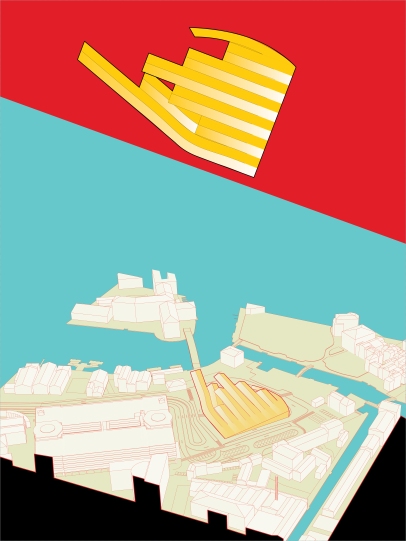
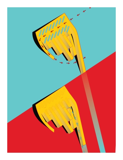
So I was just messing around in AfterEffects.  I was interested in this idea of the gable becoming the entrance of the buiding and basically what else the gable could help with other than the physical spanning of the roof.  I am experimenting with a couple ideas here, but basically, I don’t really think the roof should remain thin like paper, but needs to get thicker and more chunky.  Then, as you approach, they kind of pop out in all directions.  I thought they could light up or do something to coordinate with the buses.  Perhaps they could present the bus schedule, something that doesn’t currently exist at this bus station.  Maybe, one could flash where to buy tickets and another could have departures/arrivals or something.  I don’t know.  The other idea is that since currently the entrance sequence to the building is related to the roof…and that you basically need to engage the digital archive building to get to the buses…maybe the roof could present the material in a new way.  I thought of Star Wars and how the beginning of the movie they have that canted text receding into the screen.  I like that.  I don’t think it will stay like this… it is more of a place-holder until i can think of a better idea, but i think that the material of the venice archive could be presented in a more interactive way than the traditional archive experience.  But then the question of why?  Archives are mainly for archivists and the material inside, while incredibly important and descriptive of a society in a certain time and place, it is also dty and boring.  The average person has no need to engage an archive.  So, what if the material could present itself in a new way…so that you were engaged in it.  Maybe you would never actually care that so and so bought some land in venice 200 years ago, but if the store unfolded for you as you walked to your destination, you might enjoy it.  Here is the idea in a quick video.


Filed under: Uncategorized

VENICE 5: MORE CIGARETTES

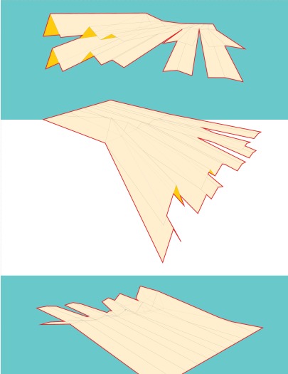
Here are a couple updates on the Venice Studio project I did this weekend.  Basically, I am continuing the structural concept of a series of dormers acting like a folded piece of paper.  The archives building is below the part that cants upwards.  Half of the buses park on the roof of the building, but current flow or footprint of the buses is undisturbed.  Now, you will access these buses through the archives building which will sort of act as a threshold in and out of the city.  You will ascend to the roof similar to the way you would enter a train platform in many small stations.  The dormers are beginning to fold away from eachother and do things other than be a typical roof.  Most notably I think are how the longest dormer re-flattens out and bridges the road creating a new direct connection to the buses from the train station and Calatrava’s bridge as well as folding down into the ground becoming the entrance to the building.  So, people are forced to engage the dormer by walking on the roof as the means of entry.  yup.  we’ll see.

Filed under: Uncategorized

VENICE 4: GABLES

I guess it is sort of a typical/over-done thing done by young American architects to explore the Gable as a means to explore design.  I think it is sort of played out, but I have never tried to play that game…so I might now.  Basically, it calls to this nostalgic, vernacular American thing….maybe that is why I am attracted to the American Spirit cigarette box.  But anyway, I think the gable exploration is super relevant to Venice.  We have researched the gables and the forms of these buildings of Venice.  And our site is sort of an anomaly within Venice (a brutal, modern bus station/parking building/train station within an otherwise homogeneous city) which is sort of an anomaly in itself within Italy ( a city stuck in its own history).  But I see a couple options.  You can design something that is an anomaly to all those conditions…something that doesn’t fit into anything around it.  Or, you can try to blend into the context…but there is no way I am going to make some neo-renaissance thing.  I am pretty sure I would be kicked out of school for that.

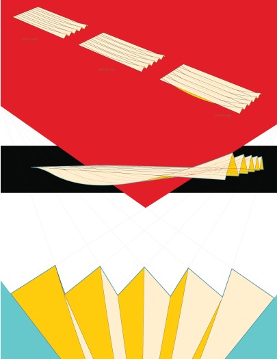
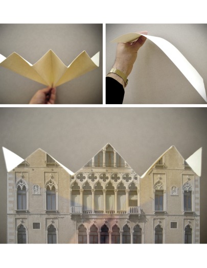
So I was attracted to the gable roof form.  Basically it is two fold for me.  It calls to the geometry around the site, but in a subtle way.  It isn’t hitting you over the head… actually, I like to think that if this was a real project and it was standing there, a person might feel comfortable with the shape and form of the building without understanding its direct reference to the roof forms surrounding the site.  Maybe the connection to the context could almost be subliminal.   The second fold is that the gable can be seen as a stiffening device.  If you hold a piece of paper out (think of this as a concrete roof slab), it droops and sags and cannot support its own weight.  But, if you fold it like a fan (or a series of gables) you get the effective depth of the whole system and it can be more rigid and span further before failing on its own weight.  So basically, the project is going to call for sheltering an existing bus station so there will be a building component and actually just an extended, open-air roof component, that will be un-programmed covered space..  I imagine so far part of the building being sort of growing out of the ground gradually, and then buses can exist on the roof of that building…then I imagine the roof of that building moving from something flat, that a bus could drive on, to a gable, where it needs to extend to an outdoor, covered space.  I am supposing that the gables will be able to do more too…like turn into bridges and connections to various points of the site, even dive into the ground to become ramps at certain points.

I developed some basic methods about gables shifting from flat to peaked and now the next step is to introduce it on the site to test it in context with more constraints.

Filed under: Uncategorized
VENICE 3: CIGARETTES


I often look to the end product before i get into the design.  For example, two months ago, I had absolutely no idea what I was going to do for my thesis project, but I could have told you pretty much exactly what the final presentation was going to look like.  I figured out the paper size…the basic layout for each board, and even how I would make these shadow-box models I was thinking about.  For this semester I have turned to the American Sprit Blue cigarettes for inspiration.  I will use the colors from their packaging and the basic, bold, graphic style too.  I like it.  I don’t think it has much relevance to Venice (where my site is), which could be a mistake.  Oh well.  This semester I am doing everything on 18in x 24, and I am trying to make 4 boards a week.  This way, during reviews and whatnot, I can just pull out my drawings and they should all be graphically consistent and hopefully precise and nice to look at.  It’s all a bit bright and bold.

Filed under: Uncategorized
MUJI THONET CHAIR/DESK

muji on left...thonet on right


So this is by no means new…but I can’t get enough.  Basically everytime I see this chair I loose my mind.  I think it might be my favorite object around these days.  Many many many years back Thonet created chair #14.  Not only was this chair absolutely beautiful, crafted of lovely bent wood, but it was one of the most produced chairs (if not the most produced) of all time.  It dissasembled and packaged away into a shipping crate very nicely and something about the timeless nature of its design has kept it relevant for over 100 years.  It is also one of the first examples of mass-produced bent-wood furniture, undoubtably a predecessor to Eames’s bent ply furniture that I also love.   It is just amazing.  You have for sure seen it and may even know it as the “French Bistro Chair”.  If you go out to a few quaint cafes I’d bet you  could spot one pretty quickly!

Anyways, the chair is rad and it is everywhere and not even that expensive.  But, it was also in need of a face-lift to usher it into our time.  So the brilliant designers at Muji took it upon themselves to update the classic design.  I think a lot of times when people or companies do this, they totally mess up something that didn’t need to be tinkered with (maybe the Volkswagen beetle comes to mind)  BUt in this case, I think the designers at Muji really did an amazing job.  It is so amazing.  I don’t think I have anything else to say about it…I mean, it pretty much speaks for itself.  So fresh…so clean.

Filed under: Uncategorized
MATERIALS CLASS

I am a teaching assistant this semester for Mark Mulligan and Daniel Etzler’s Materials and Construction course.  It is really fun and experimental and I am having a really great time helping the students.  They are all first year architecture students so some of them have a background in building or architecture or construction, but others have virtually no experience making things.  As I love to make things myself, I can’t think of anything better than to teach others how to also!

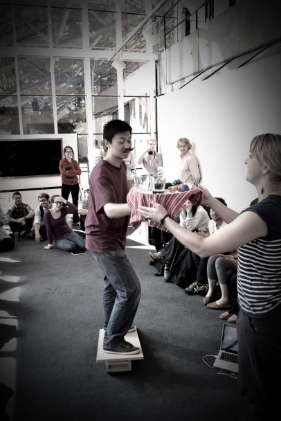
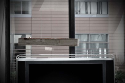
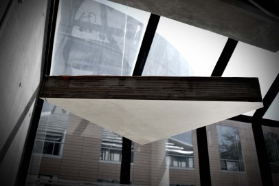
These are a few images from their second project.  The students were asked quite broadly to explore equilibrium.  They were shown in class some Calatrava models, some tensigrity structures, and some Calder sculptures.  The idea is an introduction to statics through material exploration.  I encouraged my students to look at the work of Junya Ishigami.  Many of them became obsessed with flatness and with structural intrigue.  The idea of looking at something and not really understanding initially why it works is very compelling to me.  I think they were very successful.  I was also very happy to see that the students held back and showed a great deal of restraint in their designs.  Some time the most simple thing is the best thing.  One group balanced two seemingly equal blocks over a fulcrum loaded asymmetrically.  The idea was that they could pre-bend the steel between the two so that when it was in equilibrium they would achieve a total flatness.  Another group took a seemingly very heavy laminated triangle and moved the centroid so that it would hang in space totally flat but not from where you would expect.  As you move closer you can’t even figure out how the thing is standing up.  And the last group created a narrative for their project where they introduced food loaded on a tray, supported by a wine bottle (also asymmetrically loaded) and all balanced by one of the students standing on a rolling pin himself.  All of the work was reall

extreme asymmetrical flatness after loading


stealth triangle


the balancing act!

pre-bent before loading

elevation

from below

Filed under: Uncategorized
DEFAULT ARCHITECTURE

it is coming…

Filed under: Uncategorized

VENICE 2…BA$$ WOOD SITE MODEL

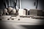
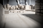
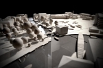
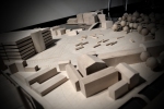
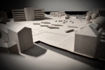
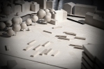
The first task of the studio is usually to make a model of your site that you can use as a reference when making study models for your project.   I think the trick is to make it really nice the first time so that you don’t have to do it again.  Also, models have a way of getting totally trashed around here so it is important to make it out of something solid.  Myself and a couple of other people in studio made it in a weekend.  Basically, we laser-cut the site out and set it over water.  Then, we bought a bunch of solid Ba$$ wood and started to carve the buildings out.  Basswood is expensive but strong and has nearly no grain, which can be really distracting in a model like this.  Basically everything  not water is birch and bass wood, and the rest is really dark grey plexi glass.  The best thing I think about it  (and you can see it in many of the pictures) is that it is made in 6 pieces that are about 18in x 30in each.  Together the whole thing is like 54in x 60in so it is really big.  By making it this way, we can each put a piece on our desks and just assemble it at the end.  The problem currently are the trees.   They should also be wood, but they look a bit silly at the moment.  I think I will probably go back and shape all of them so they are chunky shapes that are not spheres.  Kind of looks like candy land or something.

Filed under: Uncategorized

VENICE 1…AND A LIGHT BOX

So I am back at school now.  It is nice to be back working on my own designs and I am excited to use some of the tricks and things I learned at my internship.  I do miss Paris though.  I think Cambridge is a bit of a shit-hole.  Oh well…basically I have to finish one more studio and my thesis and I will be out of here.  Back to Europe?  Maybe Asia?  I really don’t know…maybe start something with some friends.

The studio I am taking takes place is Venice, Italy at Piazzale Roma…the bus station.  Basically if you have ever been there, you realize what a shit-show that bus station is.  Our task is two-fold; one to cover the existing bus station and two, to introduce a new archive building for the city of Venice.   It is a very complicated project and is super interesting too.  Our studio is taught by a Spanish Architect called Luis Rojo de Castro.  He seems really cool and I basically want to write down everything he ever says to us.  His firm is called Rojo Fernandez-Shaw.  I chose the studio based basically on his website and personal work.  I think he is a really good architect from what I can tell about architecture and I figured I could learn a lot from him.  I met with him today and I think he understands my ambitions for the studio.  I really want to get into how the building works…and to make a more real project.  I am interested in the digital space of an archives building…the collective models of knowledge that exist in cloud-based systems, but I am also quite interested in the agency of the architect to actually design physical space.  At the end of the day a building is designed by an architect and I think that is a great thing.  Knowledge and digital space and things can be collective but physical space in my opinion shouldn’t be so democratic.   When physical space has too many voices things tend to be muddy and watered down.   I would never presume to design my own car or any other thing I wasn’t expert in…rather I would like to leave that to designers and engineers who know what they are doing.  Luis, my professor told us that an architect has to be interested in buildings…a designer is a stylist who can make things aesthetically pleasing.  I want to be more of an architect and less of a designer and  I want to learn to make things with a perspective.

How can digital space inform and enhance physical space?  This is a question I am extending into my thesis.  Does video kill the radio star?   I would argue that it cannot, and that it is boring and unsatisfying to the end-user if it does.  On the other side of the coin, a denial of digital spaces in physical realities is naive.  Digital and Analog or Digital and Physical cannot be seen as opposites, they cannot be pitted against one another.  Rather, one can inform the other and open new spatial opportunities.

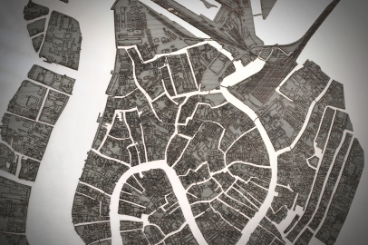
In studio I like to get the ball rolling by just making something.  Otherwise, I could find myself weeks into the semester with no work to show…just a lot of thoughts.  So last week, I got some birch veneer and laser cut a map of Venice into it.  I placed it over a translucent piece of plexi and lit it from behind to better understand the water ways and canals of venice.  A typical Nolli map misses one key aspect of Venice…the water.

1:10000 light box study

1:10000 light box study

Filed under: Uncategorized
Pages